Let my people camp
Hey there, fellow campers and outdoor enthusiasts! If you've ever found yourself caught in the whirlwind of campground bookings, you're in good company. We're about to take a closer look at the fascinating world of camping utilization data. From the shifting seasons to unexpected campsite gems, let's unravel the insights that make camping a thrilling adventure both on and off the grid.
The Art of Camping Amid Booking Blitzkrieg
Picture this: it's a crisp winter morning, and the campground booking portal opens up like the gates to an amusement park. You're armed with your coffee, your determination, and your heart set on a prime camping spot. Yet, the slots vanish faster than marshmallows in a campfire. Yes, dear readers, the game of securing a slice of nature's paradise is an adrenaline-pumping escapade akin to a roller coaster ride.
Latitude Dance: From South to North, the Spring Migration
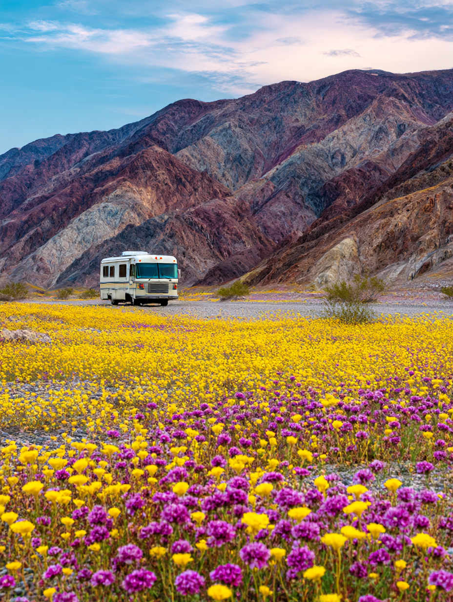
As winter recedes, and the first whispers of spring flutter in the air, campers start spreading their wings, or rather, pitching their tents. A curious pattern emerges - winter camping hotspots gather in the southern United States like a secret party, while the arrival of spring sets off a nomadic northward migration. It's as if the landscape itself is coaxing campers to embrace the warmer embrace of Mother Nature.
Unearthing Hidden Treasures
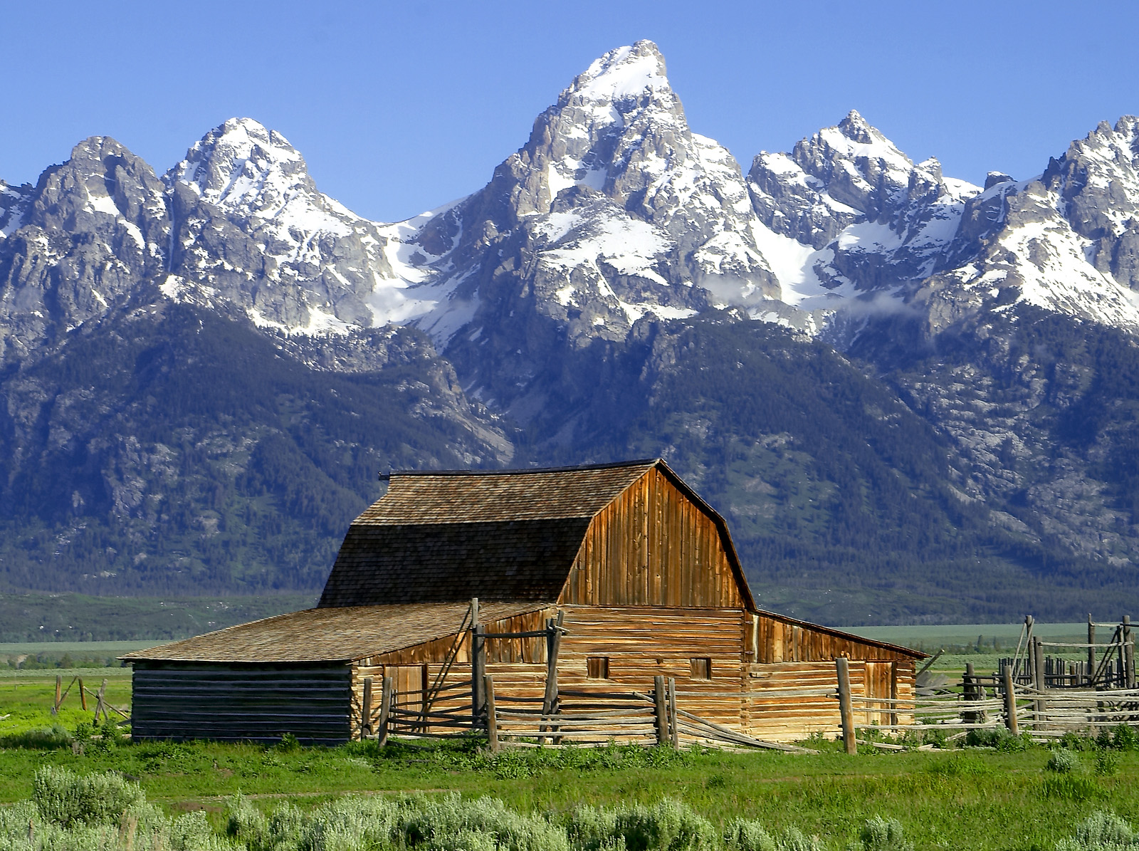
In this digital age, the virtual map of campgrounds holds secrets aplenty. While the spotlight shines on the traditional tents and RV sites, a constellation of cabins and lookouts dot the wilderness. These remote retreats, like pages from a storybook, beckon the adventurous souls to explore their enigmatic charm. I mean, who wouldn't want to stay at Granite Butte Lookout?
The Enigma of Unrelenting Zion
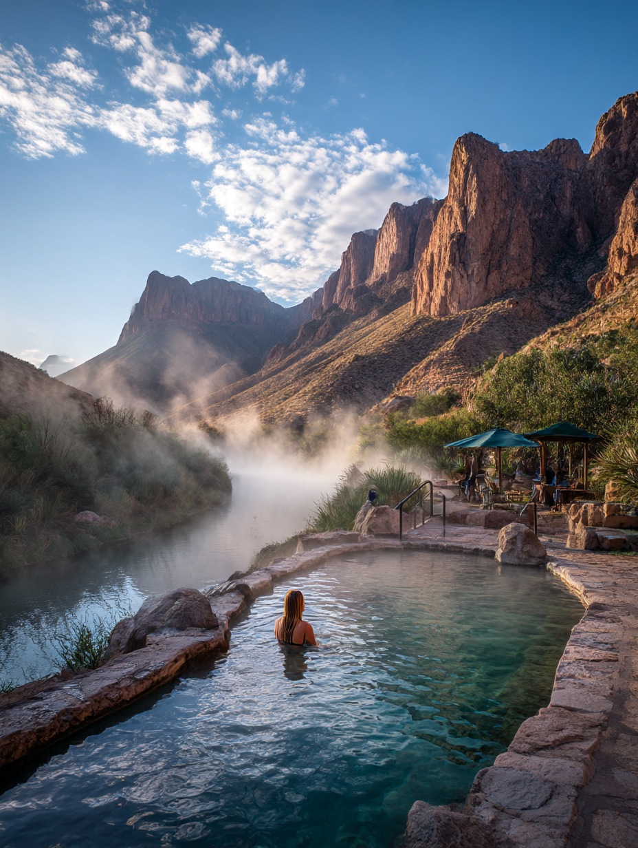
Ah, Zion National Park! A name synonymous with breathtaking vistas and captivating hikes. Yet, what might surprise you is the evergreen popularity of this majestic park. Throughout the seasons, the utilization needle of Zion's campgrounds stubbornly hovers around full, refusing to yield even a square inch to uncertainty.
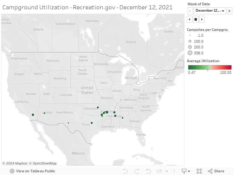
Tableau Visualization
The size of the bubble indicates how many campsites / lookouts / cabins are at the campground. The color indicates how much it is used for the week being shown - red is heavily used and green is less heavily used. The dates used here aren't full calendar year due to the government's fiscal year.
Push the ▶ to start the animation.
Methodology
Our data journey was no walk in the park. We sifted through reservation numbers, merged datasets, and tested out various visualization possibilities.
- Retrieve data from the below data source, note the Federal Government operating year is October to September.
- Filter data for overnight camping reservations, and exclude management sites
- Join data to other datasets to get other metadata, e.g. Yosemite and Wawona Campground, so we can view more friendly names for parks and campgrounds.
- Count the number of reservations that occur for each calendar day
- Determine utilization by campground - reservations / # of campsites at campground
- Note that I saw some scenarios where daily utilization exceeded known campsite supply. This is typically driven by campgrounds that have walk in sites and reservable sites since both are in the reservation data. I capped results at 100% - Load data into Tableau and remove campgrounds that had strange latitude or longitude data.
- Aggregate data by week within Tableau and take the average daily utilization to determine weekly utilization
- Shortcoming here is some campgrounds could be completely booked on weekends but available on weekdays. The average will make them look available for the week.
Data Source
Data from recreation.gov via https://ridb.recreation.gov/download